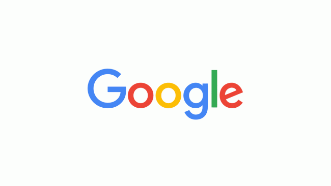
Google has unveiled a new logo that looks more modern and playful.
This change has come just after one month of a major restructuring of the company.
The new Google logo resembles the logo of its parent company, Alphabet.
It has adopted a sans-serif typeface that suits its image. Some of the featured in the letters have been smoothened and the colors are also softer.
Google changes logo
This popular search engine giant has changed its logo six times earlier but this time the change represents a huge leap.
In 1999, Google first made the letters smooth and then chose four colors for its logo. Since then, the logo gets flattened every time.
In addition to this, an uppercase “G” striped in all four colors of Google can be seen on the browser tabs which has replaced the tiny “g” in logo.
This new design can be seen on the Google homepage where an animated hand wipes away the old logo and then writes the new one in its place.
This multinational technology giant has given reasons for the change stating that nowadays many people access Google on their mobile devices rather than their desktop computers.
This new logo would surely work better on different sized screens and enable people to get a better picture.
Google also talked about its plans to use four dots comprising of blue, red, yellow, and green colors in its signature with multi-colored “G” representing it.
Many people found it hard to adjust to the change but some happily accepted it. Overall, we can say that the new logo of Google is a WINNER.


